Online Consult Checkout Experience
We redesigned the instant consult checkout experience to make it easier to start an online consultation on the desktop.

Context
- Instant consult lets users connect to a doctor in less than 60 seconds. Users can chat or talk with a specialist
- Users can either type in the symptom (eg. Tooth Pain) or type in a specialist (eg. Dentist)
- Depending on the symptom, the user can either select a Specialist or a Super specialist doctor to consult
- A doctor will be assigned after the user has paid for the consultation. User cannot choose a doctor (not technically feasible currently)

This is how the original flow looked like
- I closely worked with the PM and design lead on the problem statement to come up with intuitive UX solution and UI design
Due to Covid-19 Lockdown, there has been a surge in no. of online consultations as well as new competitors. It was time, we realized that we need to revamp our checkout experience
The goal of this redesign was to improve the user experience of starting an online consultation thereby making it a hassle-free experience
FIRST STEP
Digging into the Data
We wanted to understand user behavior in the current flow, so we pulled the traffic data from Clevertap to see the current conversion rate and major drop off points

- For the month of march- Out of 30,885 (100%) users on the selector screen, only 4484 (14.52%) users were reaching the checkout screen
- This accounts for 85.48% users abandoning the flow right off the bat after seeing the selector screen
- This was a major concern for us because a user who is visiting the site on the desktop web has a higher intent of consulting than a user who is visiting the site on mobile web or app
We had our fair share of hypothesis for the major drop-off in the consult funnel. The top most were-
- Bad Usability
- Users are confused about online consultation
- Online consultation is expensive
To test our hypothesis, we began with our research process which is mentioned below
SECOND STEP
The Design Audit
The next step for me was to analyze the current flow and list out usability issues. Note: It was not a user test but a heuristic evaluation

- User needs to click 10 times before reaching the checkout page. This results in high friction and is a bad experience for the user
- Symptom selector was giving wrong outputs and was potentially confusing when searching with various symptoms or specialists
- Too many unrelated input fields on the same page puts unnecessary cognitive load on the user
-There was no indication of what type of doctor would I see. Lack of labeling of doctors on checkout screen was confusing
THIRD STEP
User Research
We prepared a small survey and sent it out on different social groups like Facebook, Linkedin & Telegram to understand the general consensus on how people deal with health issues

We also did a semi-structured interview with ~10 users with a lot of open-ended questions. The majority of these users have done clinic bookings at least once through Practo. Only a few of them used consulted online.
Findings
- Unsure about the quality of doctors on online consultation
- Did not believe that online consultation could solve my health issue
- Cost does not matter to me much if the treatment works
- Unsure about the wait time to consult a doctor
- Don't understand how online consultation works
- No preferred payment option
- Prefer both offline and online consultation with the same doctor
It was evident from the user study that building trust is far more important than touting features. Allowing the users to choose a doctor for consultation is another way to build credibility (but it's not technologically feasible right now). Users do not like gimmicky statements like "Doctors recommend X".Physical consultation is superior to video followed by video, audio, and chat. Also, one of our hypothesis of online consultation being expensive was proven false
Ultimately, all the research gave birth to our Problem Statement
" How might we enable trust in the platform and make it easier to consult "
FOURTH STEP
The User Journey
Our users are millennials aged between 25 to 35 living in Tier 1 & 2 cities of India. After understanding their pain points and goals at different stages, we mapped out a typical user journey

Design for Trust
From our research, we found out that building trust is far more important than anything else (eg. touting features). Building trust will help us build long term relationships with our users who will come back to us whenever they need help regarding their health. Trust has to be thought through the entire customer journey from the discovery of the platform to post-consultation experience
We brainstormed and identified two ways (implicit & explicit) to build trust and credibility in our service.
Implicit ways that build trust
Being transparent with our users. Be it bad reviews or ratings. Show them everything.
Educating the Users with the right contextual information at the right time.
Being Consistent with the service experience across various channels
Be like their friend in need Communicate with the user as if you are their friend who cares
No Dark Patterns- Not forcing the users for a certain action or hidden agenda.
Make your service really easy to use
so users can achieve their goals quickly and without much effort

Explicit ways that build trust
- Prominent Profile Images
- Using Real-World Images
" The challenge was to design and integrate these trust indicators in the user flow in such a way so it would make sense to the user "
One of the constraints was to keep the original flow intact ( Selector screen Login Checkout Page Payments ) due to limited tech bandwidth available at the moment. So there are no prominent changes in the user flow but I had full freedom to completely overhaul page-level designs and interactions
At this point, we generated a lot of insights from the design audit & user research. The next step was to start with the design itself
Design Process
We followed a straightforward design process of
Design User Test Iterate
- Since most of the employees at Practo fall under our Target audience group, it was easier for us to run our designs through them and get their feedback
- Design testing was done with Product Managers, Engineers, and non-designers who are not part of the redesign project to keep the feedback neutral
IMPORTANT NOTE
I’ve tried to document things in a way to make it easy to understand which may have not been the actual order of execution. Also, to shorten the case-study (and save my time and yours), I’ve oversimplified things or grouped similar information from different timelines under one section
The Selector Screen
Scroll down to view the thought process, rationale and detailed interactions for this screen

Information Hierarchy
- Selector page consists of 3 main components- Search, Specialist Picker, Symptom Picker & Trust Builders
- Data showed that 57% of Transacting users search for a specialist instead of a symptom. We saw a similar pattern in the mobile web also. That is why I placed the specialist picker on the top
- Trust builders are placed on the right side of the screen so it does not interfere with the primary action the user needs to perform

IDEATION
Specialist & Symptom Cards
- We iterated several versions of specialist and symptoms cards, each one having a different intention
- Users found it easier to scan icon-based cards rather than real images
- Users felt more comfortable reading the horizontal card as compared to vertical. This was because humans naturally scan left to right
- Most of the users preferred iteration no. 10 because it mentioned that a doctor will be available immediately

IDEATION
Stats & Testimonial
- Iteration no.1- Users did not read it because it did not capture their attention and found it 'boring'
- Iteration no. 3- Feels more like an advertisement and users ignored it due to banner blindness cognitive bias
- Iteration no. 4- Ornamental style icons acted as a hook to grab attention which is accompanied by detailed sentences made it look more trust worthy and real

- Users did not bother to read the full user testimonial because it was too long but they felt testimonials do add to the credibility factor. Adding a short title (iteration no. 3) allowed for a quick overview of the user comment which worked out to be the best iteration

IDEATION
Doctor Cards
1

This card only has limited information and emphasizes only on the ratings
2

This card only has a lot of information about the doctor to build trust

This card emphasizes on Practo verification seal
3

4
This card emphasizes on the years of experience of the doctor

This card emphasizes on the no. of consultations the doctor has done
5

This card emphasizes on patient satisfaction
6
- Users found iteration no. 5 to be most convincing out of all because the consultation count tells them that the doctor is skilled enough to diagnose problems remotely via chat or call and that's much more assuring than simply stating the patient satisfaction
INTERACTION
Symptom and Specialist Search
- The goal of designing a search was to facilitate easy symptom and specialist search
- The search box is visually distinguished with an open text field & is accompanied by a magnifying glass which is universally recognized as a search icon
- Search has been classified into Problem Area, Specialist, Super Specialist to aid occasional users who search by symptom or frequent users (eg. female users searching for gynecologist) who know which specialist they want to consult
- Results start to populate when the user starts entering letters. The results are ordered according to the most common and highly searched problem areas and specialists

IDEATION
Login

Iteration 1- Login is a cognitively demanding task. This iteration puts the login at the central focus of the user so they are not distracted by anything else. The user has to simply scan from the top to the bottom to understand what is happening on the page. But the users found this layout busy and slightly confusing

Iteration 2 - This iteration separates the number entry area (left) from the informational area (right). Although the eye has to travel a farther distance to consume all information, the users found it easier to understand what was happening on the screen and found it to be more familiar. So this was the winning iteration
INTERACTION
Login Flow
- Login interaction is designed to minimize the number of clicks to reach the checkout page
- The user needs to click only 1 time (on the continue button) to reach the next page
- When the user lands on the login page, the phone number field is already active, saving an extra click effort
- The number entry box automatically detects and sends the OTP when the user has entered 10 digits. This also saves an extra click effort.
-This was done because our data suggested that more than 80% of users were entering the correct phone number on the first try on desktop web

The Checkout Screen
Scroll down to view the thought process, rationale and detailed interactions for this screen

Information Hierarchy
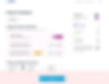
- The checkout page is the final step before the user pays for the service or the product and is one of the most important flows in any transaction.
- The purpose of the checkout page is to get a quick snapshot of the information collected from the previous screens and proceed to payment
- The objective of the checkout page is also to upsell/cross-sell other products or services. For us, it was the Practo Plus plan that we wanted the user to purchase. That's why we placed it on the First Fold itself
- Another objective for us was to integrate a specialist selector if the user has selected a symptom in the previous screen. This had to be done in such a way that it does not interfere with the user's decision of tapping on the Pay button
.png)
ITERATION
Call to Action Placement

Iteration 1- The most obvious location to put the CTA is after the Total Payable amount which hierarchically makes the most sense. But the problem was that the users completely ignored the Plans section and did not even bother to spend time on the page to see what else was there. They clicked on Pay CTA as soon as they landed on this page. This would hurt upsell metric of our plans
Iteration 2- In this iteration, we tried placing the CTA below the fold (which is not a good practice, I know). We did this to let the users spend a little time on the page so that they can explore the plans and the Specialist selector. But instead of exploring the page, the users were frantically searching for the pay button. We understood that keeping the CTA below the fold would hurt our conversion more than plan upsell

Iteration 3- In this iteration, we tried to place the CTA on a persistent bottom bar so the user does not have to scroll. This had an added benefit of scalability if we have more elements on screens in the future. But with this approach, the specialist selector was getting hidden behind the bottom bar and in bigger screens the CTA was actually on the extreme right bottom corner, hampering it's the visibility which would affect the conversion

Iteration 4- We finally went with this iteration. By placing the CTA right below the plans, the users were actually reading the plans before clicking on the Pay button. Now with this layout, we cannot have the specialist selector after Plans, like how we initially decided. So the next challenge was to solve for the specialist selector
ITERATION
Specialist Picker
CHOOSEN ITERATION

Iteration 1- In this iteration, we tried to put the specialist picker on top of plan selection. This seemed like a good choice at first but later users told us they thought that choosing the specialist was more important than plan selection. Because of the design, the plans were overshadowed by the specialist picker

Iteration 2- We incorporated the specialist picker in the payments bar in the form of a dropdown. In this way, the picker is not taking up significant screen space and also becomes a secondary action. At the cost of putting an active component on the information bar, we were able to put prominence on the plan upsell which is one of the goals for our page
INTERACTION
Discounts

Coupons and other discounts should be easy to apply and shopping carts should clearly display how the total was affected by the promotion. A modal appears on the right side after the user clicks on "Apply Coupon" button. We chose vertical modal because multiple coupons can be accessed by just vertically scrolling
Full Flow

More...


